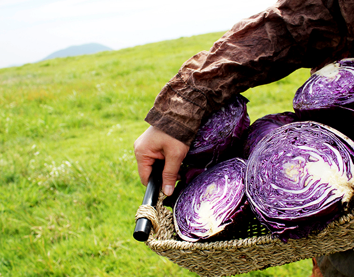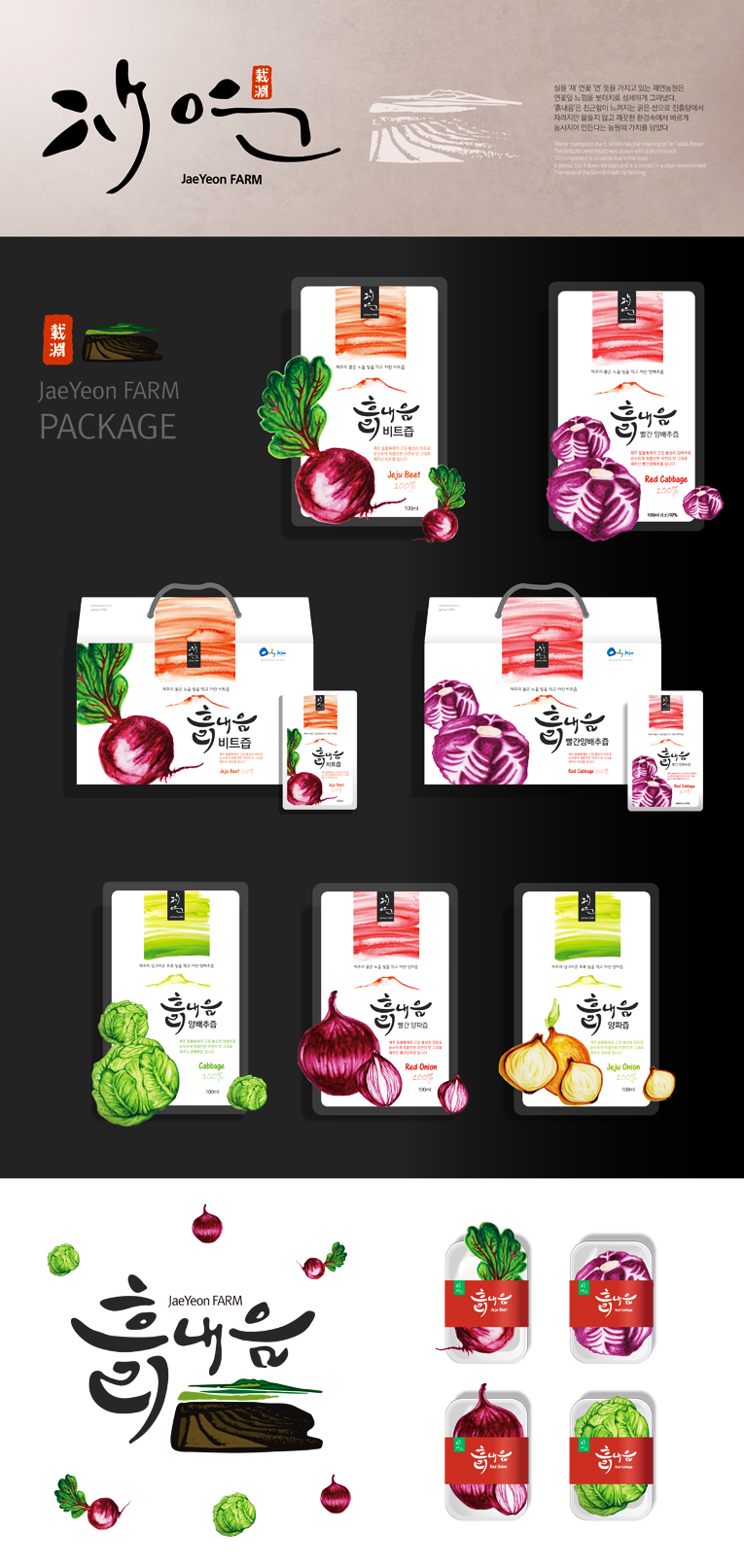
JaeYeon FARM’s CI design is rooted in the meaning of “Jae ,” symbolizing cultivation and sincerity. The hand-drawn logotype reflects the farm’s artisanal spirit, while the landscape motif evokes the purity and vitality of Jeju’s natural environment. Vibrant vegetable illustrations and brush textures emphasize freshness, honesty, and harmony with nature.
재연농원의 CI 디자인은 ‘재’가 가진 ‘경작’과 ‘정성’의 의미를 바탕으로 합니다. 손글씨 느낌의 로고타입은 농원의 장인정신을 표현하고, 풍경 모티프는 제주의 깨끗한 자연과 생명력을 상징합니다. 생동감 있는 채소 일러스트와 붓 터치 질감은 신선함과 정직함, 자연과의 조화를 강조합니다.