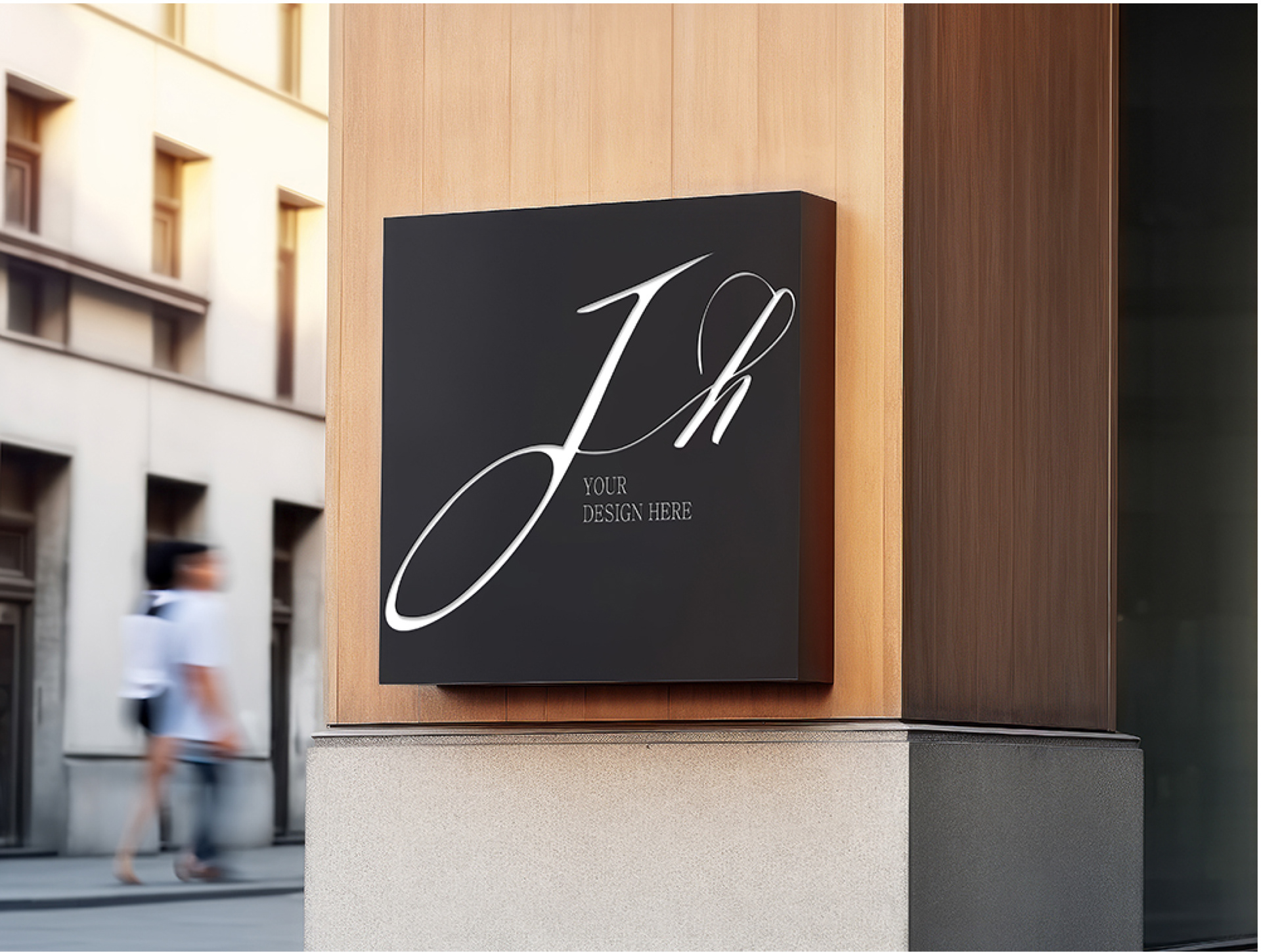
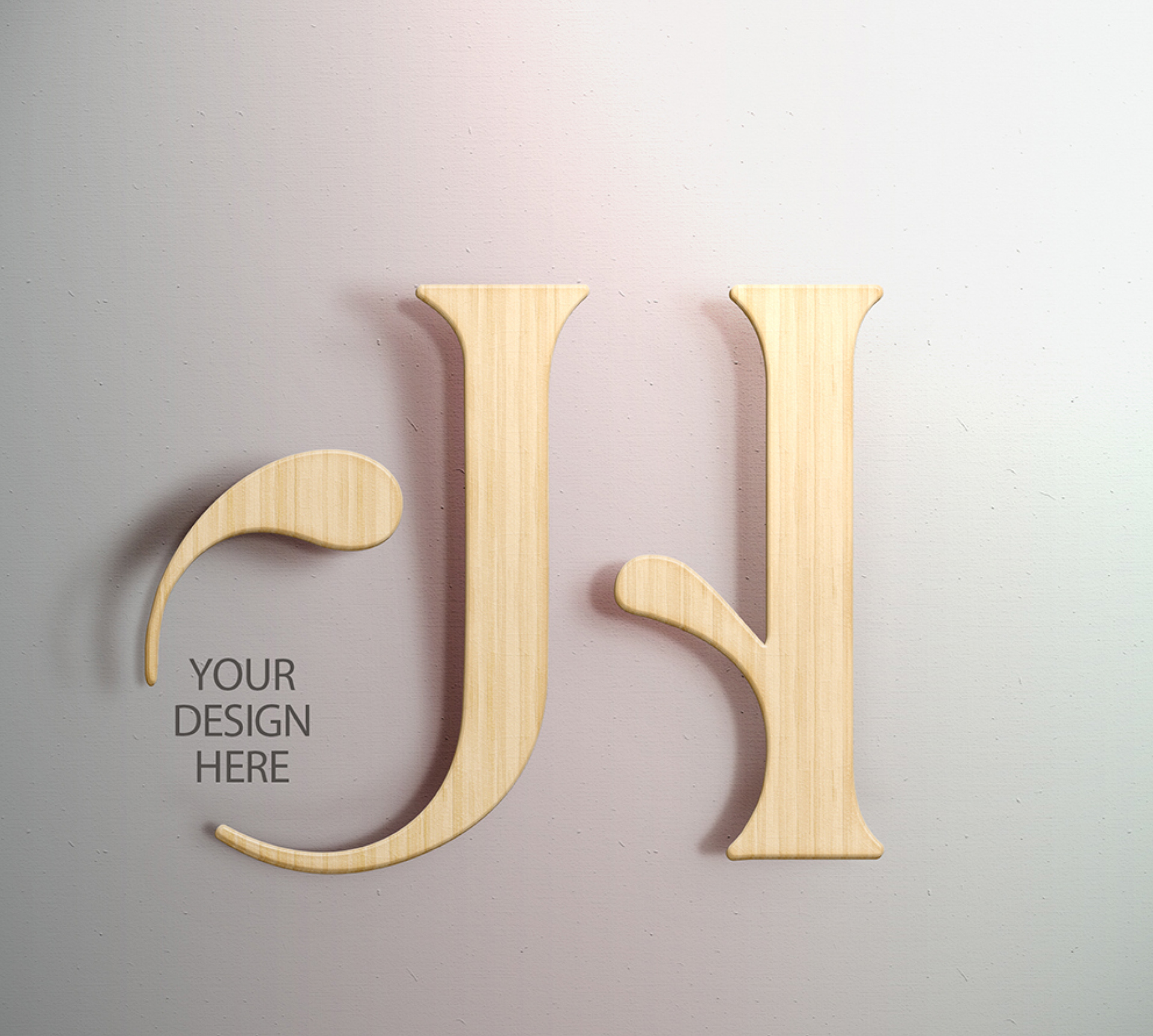
로고의 J와 H는 구조적 안정성과 조형적 유연함을 동시에 담고 있으며,
메탈, 우드, 라인 등 다양한 시각 표현은 브랜드의 다채로운 공간 해석력과 미적 감각을 상징합니다.
JH는 기능을 넘어 감성을 담은 공간, 머무르고 싶은 디자인을 제안합니다.
메탈, 우드, 라인 등 다양한 시각 표현은 브랜드의 다채로운 공간 해석력과 미적 감각을 상징합니다.
JH는 기능을 넘어 감성을 담은 공간, 머무르고 싶은 디자인을 제안합니다.
JH is a brand that designs the essence of space.
It goes beyond layout to craft three-dimensional spatial experiences that reflect movement, atmosphere, and human interaction.
The JH mark embodies both structural stability and aesthetic flexibility,
with visual elements like metal, wood, and flowing forms representing the brand’s versatile and refined design language.
JH offers spaces not just to use, but to feel — spaces that invite people to stay.