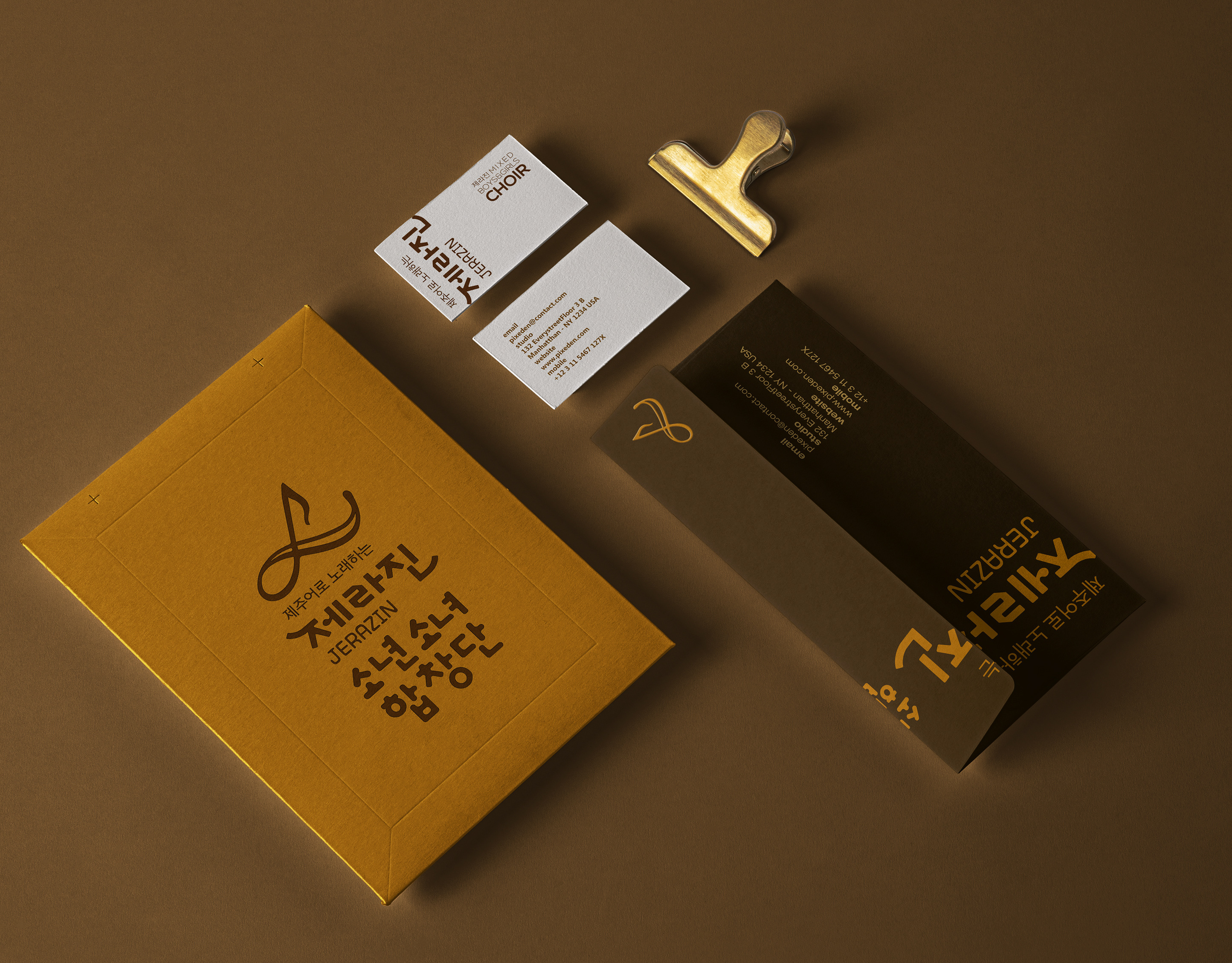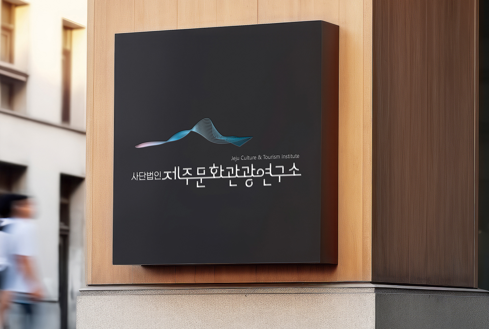
한라산의 곡선을 모티브로 제주의 자연과 문화의 흐름을 담아낸 BI는,
전통과 현대, 감성과 이성을 아우르는 그라데이션과 균형 잡힌 서체로 연구소의 철학을 시각화합니다.
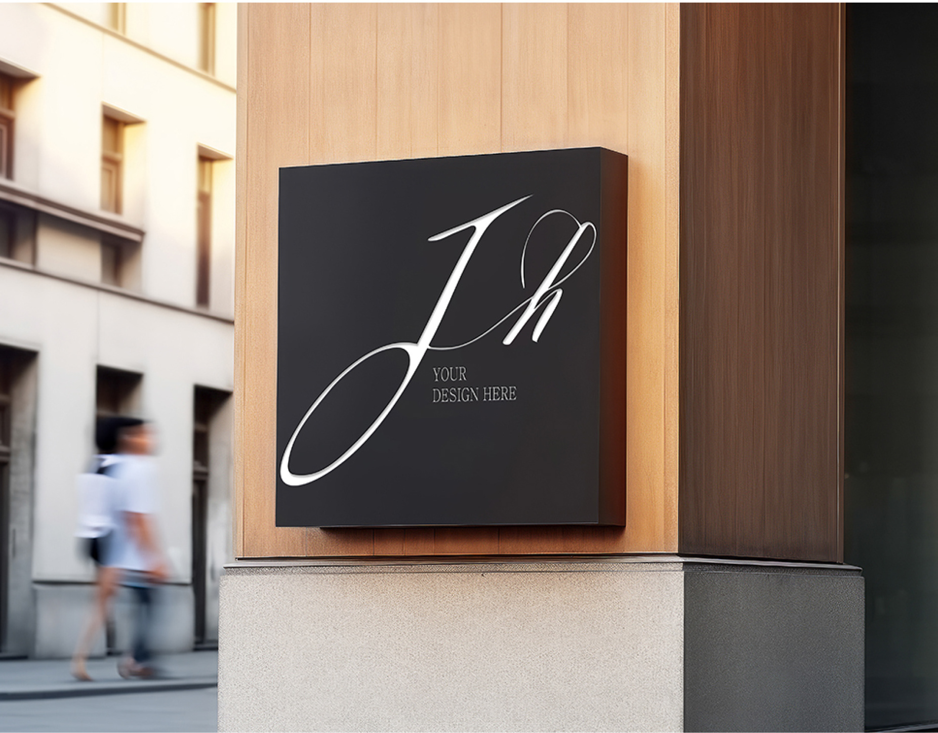
사인 디자인은 철판을 정밀하게 레이저 컷팅해 글자를 음각 처리하고,
우드 톤 배경과 조화를 이루며 절제된 품격과 따뜻한 공공성을 전달합니다.
은은한 간접조명은 공간에 자연스럽게 스며드는 시각적 완성도를 더해줍니다.
전통과 현대, 감성과 이성을 아우르는 그라데이션과 균형 잡힌 서체로 연구소의 철학을 시각화합니다.
사인 디자인은 철판을 정밀하게 레이저 컷팅해 글자를 음각 처리하고,
우드 톤 배경과 조화를 이루며 절제된 품격과 따뜻한 공공성을 전달합니다.
은은한 간접조명은 공간에 자연스럽게 스며드는 시각적 완성도를 더해줍니다.
Inspired by the curves of Hallasan, the BI embodies the flow of Jeju’s nature and culture.
Its gradient tones and balanced typography reflect the institute’s values—merging tradition with modern insight.
The signage features laser-cut lettering on a steel plate, offering a precise and refined finish.
Set against warm wood tones, it conveys both dignity and an approachable public character.
Soft backlighting enhances the visual clarity and integrates the sign seamlessly into the space.