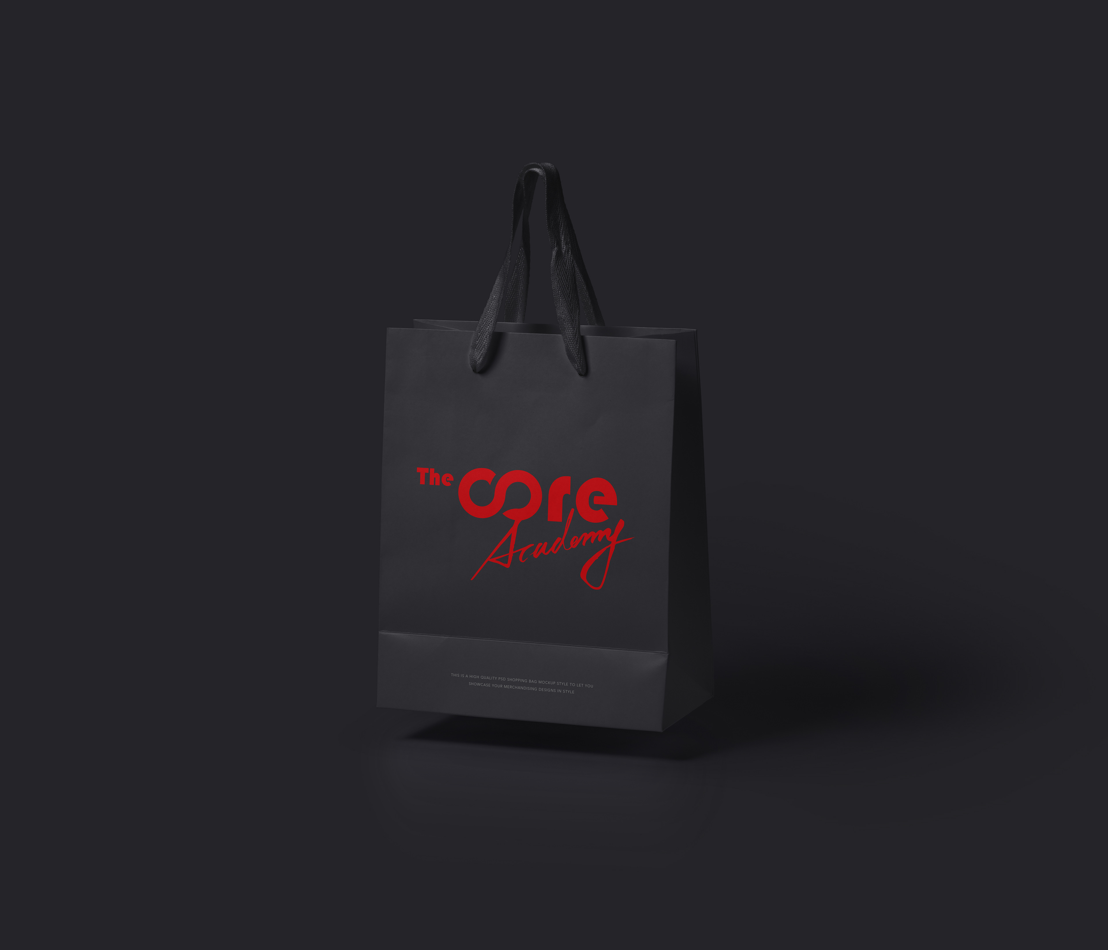
The Core – Brand Identity Design
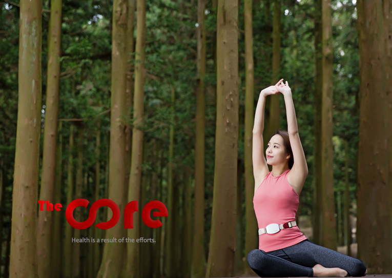
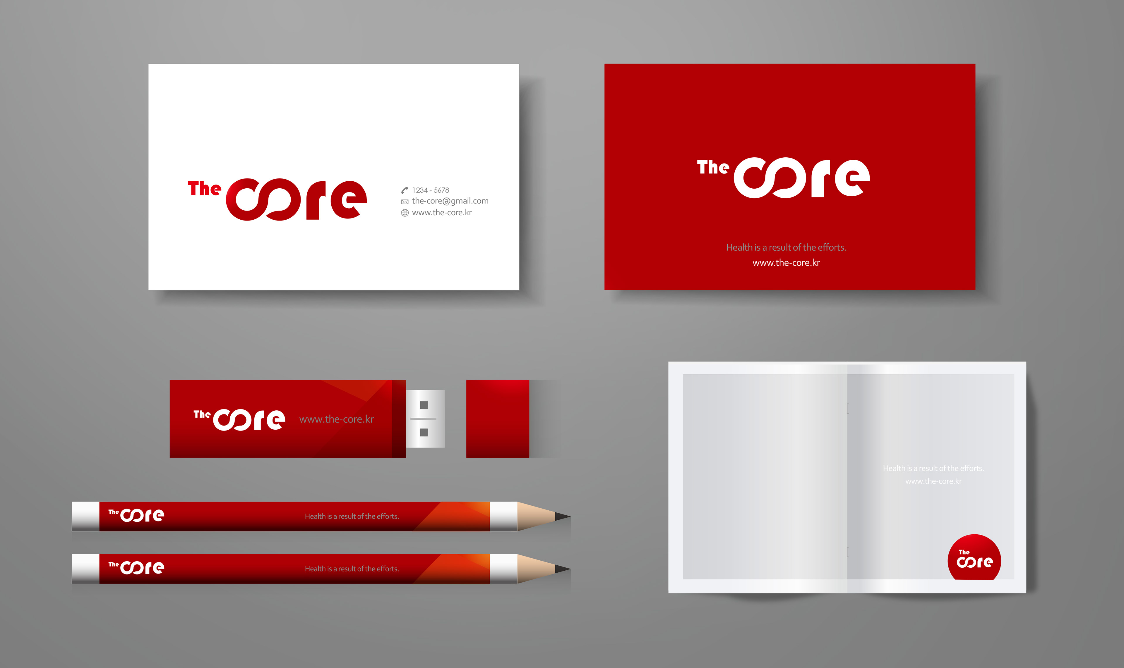
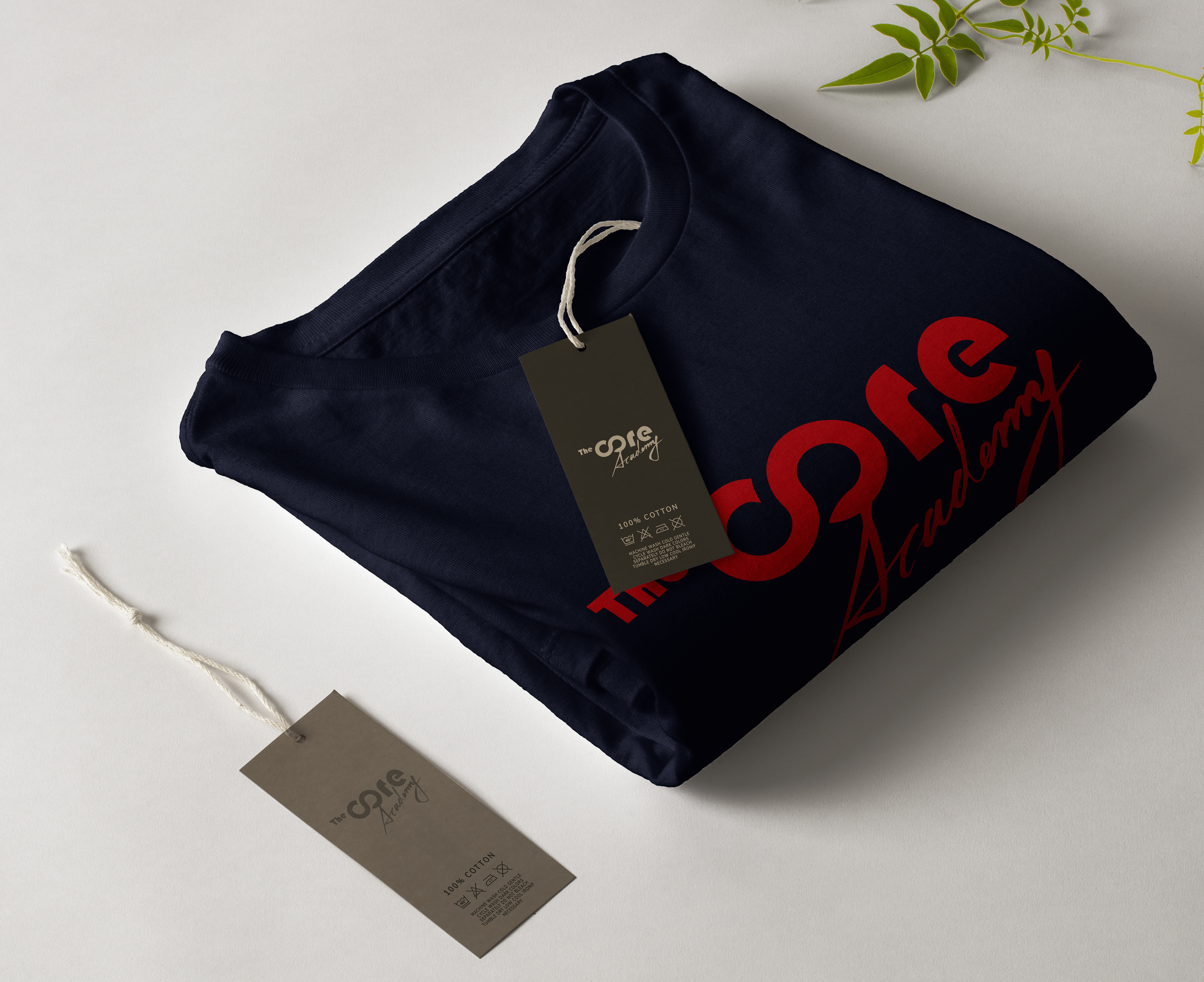
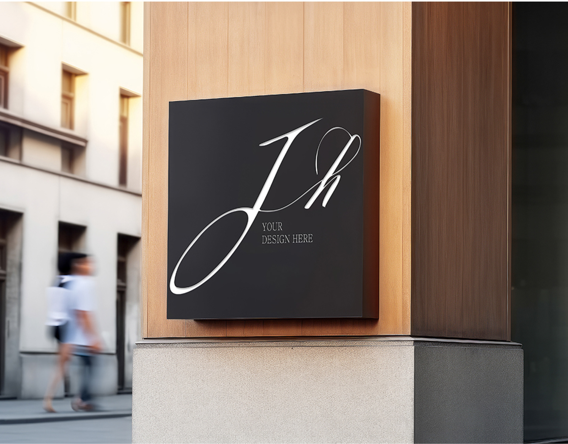
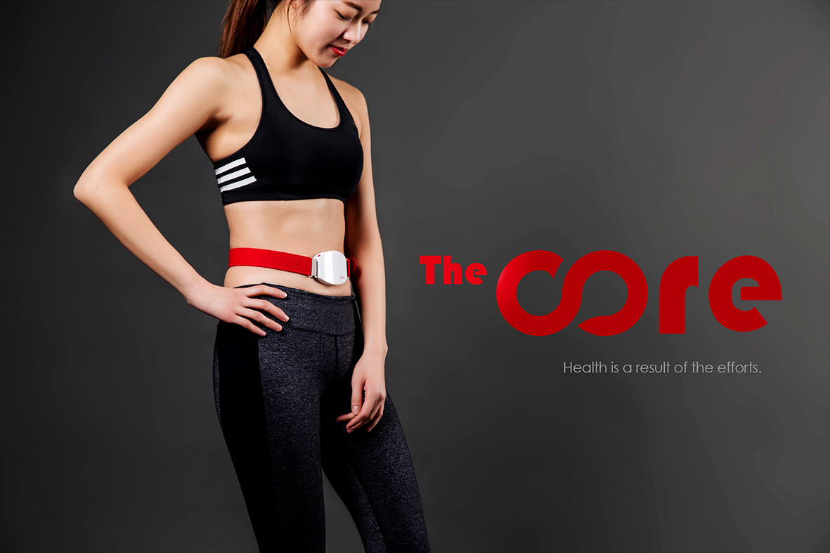
The Core brand identity focuses on the essence of health, strength, and consistency.
The bold red typography symbolizes energy, passion, and vitality, while the curved letterforms reflect flexibility, motion, and the inner balance of body and mind.
The minimal black background allows the logo to stand out with power and clarity, emphasizing the message:
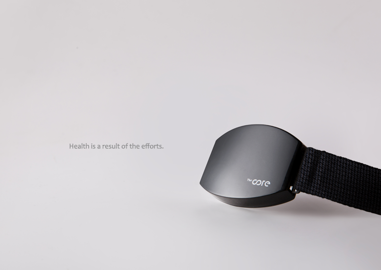
"Health is a result of the efforts."
The bold red typography symbolizes energy, passion, and vitality, while the curved letterforms reflect flexibility, motion, and the inner balance of body and mind.
The minimal black background allows the logo to stand out with power and clarity, emphasizing the message:
"Health is a result of the efforts."
This brand design communicates a core philosophy of self-discipline, endurance, and inner strength—perfect for fitness, wellness, or performance-driven brands.
The Core의 BI 디자인은 건강과 균형, 지속적인 노력을 핵심 가치로 삼고 있습니다.
강렬한 레드 컬러는 에너지와 열정을, 유연한 곡선형 타이포는 신체와 정신의 균형을 상징합니다.
"건강은 노력의 결과"라는 슬로건처럼, 이 브랜드는 자기관리와 중심 회복의 가치를 시각적으로 전달합니다.
강렬한 레드 컬러는 에너지와 열정을, 유연한 곡선형 타이포는 신체와 정신의 균형을 상징합니다.
"건강은 노력의 결과"라는 슬로건처럼, 이 브랜드는 자기관리와 중심 회복의 가치를 시각적으로 전달합니다.